
Paper Ink Blog
The Paper and Ink Combinations That Make Packaging Look Premium

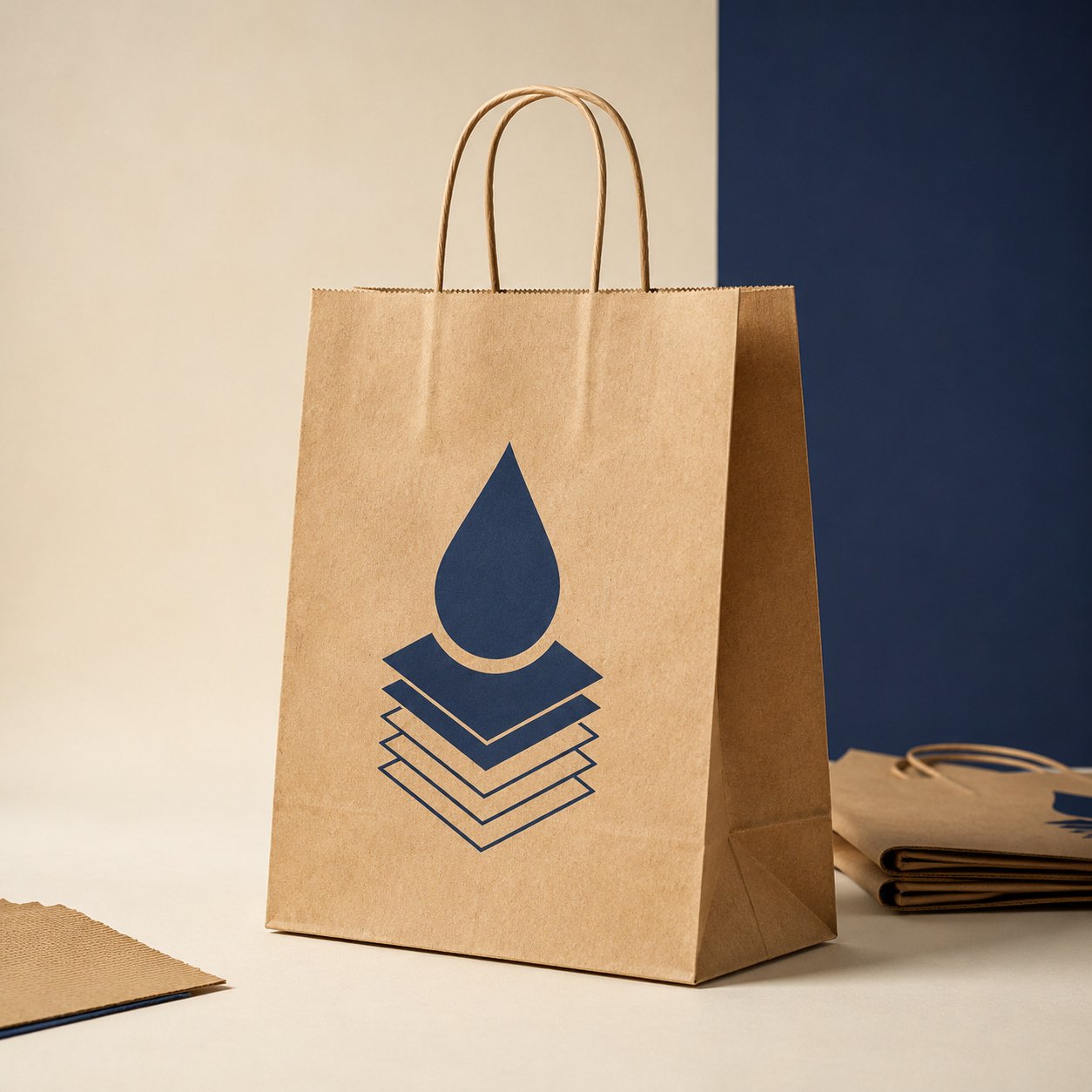
Packaging paper and ink work as a pair. The color and texture of the stock decide how the ink looks once it lands: brown kraft absorbs ink and mutes colors, while coated paper holds ink on the surface so colors stay crisp and saturated. Choose the right combination and your packaging looks premium without necessarily costing more.
Key takeaways
- Standard color inks are semi-transparent, so the paper color always shows through.
- Brown kraft rewards simple designs in one or two dark, saturated colors, not full-color photos.
- White coated stock is the best canvas for photography, gradients, and bright brand colors.
- Always check the combination on a proof for the actual material before ordering in volume.
Why your screen colors don’t survive the trip to paper
A screen creates color with light. A printing press lays semi-transparent CMYK inks on top of paper, and there is no white ink in that process: the white you see in a print is simply unprinted paper. That makes the stock part of the final color, not just a surface to carry it.
Absorbency is the second factor. Uncoated paper soaks ink in, so dots spread slightly and colors soften. Coated paper keeps ink sitting on top, so edges stay sharp and colors land closer to your file. Keep these two rules in mind and you’ll avoid most of the unpleasant surprises when packaging arrives.
How packaging paper and ink interact on common stocks
| Stock | What happens to the ink | Resulting look | Best for | Watch out for |
|---|---|---|---|---|
| Brown kraft | Absorbed and tinted by the brown base | Warm, natural, muted | Coffee, bakeries, handmade goods | Pastels and light tints nearly disappear |
| White kraft | Moderate absorption on a light base | Natural texture, cleaner color | Sweets, florists, eco-minded brands | Fine photo detail loses some sharpness |
| Coated (gloss or matte) | Sits on the surface | Vivid color, sharp detail | Product photos, beauty, corporate gifts | Gloss glares under lights; matte reads calmer |
| Uncoated white | Absorbed, slight dot gain | Soft and natural, less saturation | Insert cards, care instructions | Very small type can look heavy |
| White-faced paperboard | Behaves like coated stock on the printed face | Clean and solid | Small boxes and outer sleeves | Dark solids may crack along folds |
Printing on kraft paper: turn “muted” into a style
Picture a light green logo that looks perfect on screen. Printed on brown kraft, it turns into a dull olive because the brown shows through the ink. The same logo in black or a deep, saturated color looks sharp and intentional on that exact bag.
- Stick to one or two dark, saturated colors: black, navy, burgundy, forest green.
- Use bold type weights. Hairline fonts break up on absorbent stock, and this matters even more with Arabic calligraphy.
- Skip gradients and full-color photography.
- Don’t design with white elements unless your printer confirms they can print white ink on that specific material.
Coated stock: when you need colors close to your file
If your product sells on visuals, like colorful desserts or a cosmetics line with a bold palette, white coated stock is the logical pick. A cake photo on uncoated paper looks a little flat; the same photo on coated stock looks richer and more appetizing.
Gloss boosts vibrancy but reflects light on shelves and in customer photos. Matte feels calmer and more upscale, and text is easier to read. Choose based on your brand’s personality, not habit.
White kraft: the smart middle ground
Love the natural feel of kraft but need your brand colors to read clearly? White kraft gives you both. The light base keeps hues closer to true, while the texture still says handmade. It’s a strong fit for bakery bags, florists, and brands that want an eco look without giving up their palette.
White underbase: when do you need it?
On brown, colored, or clear surfaces, some printing methods lay down a white layer first so colors print true instead of blending into the material. If your design is full-color and you’re set on brown kraft, ask your printer whether this is available on that material. If not, simplify the palette or move to a white stock.
Five packaging paper and ink pairings that look premium
- Brown kraft + one black ink: honest, crafted look for roasters and bakeries; usually budget-friendly since it’s a single color.
- Brown kraft + one deep brand color: keeps the natural feel and adds a clear signature.
- White kraft + one brand color: clean yet warm, great for sweets and flower shops.
- Matte coated + full color: refined and quiet, ideal for beauty products and corporate gifts.
- Gloss coated + product photography: grabs attention on the shelf for food and colorful treats.
Common mistakes to avoid
- Designing on a white artboard and sending it to kraft without previewing.
- Placing tiny text or fine detail on absorbent stock, where letters can fill in.
- Expecting your brand color to match exactly across kraft and coated stock; each material gives its own shade.
- Picking the material after the design is finished instead of making it part of the design brief.
How to test a combination before a full run
- Add a temporary background layer in the stock color (brown for kraft) to preview the look, then delete it before export.
- Export a print-ready PDF at 300 DPI in CMYK.
- Review the digital proof for logo size, text legibility, and contrast against the material.
- When your first batch arrives, check it in daylight on the actual product before you reorder.
Where to find these materials at Paper-Ink
Our packaging range includes items where you choose the stock yourself, such as custom printed cup holders in coated, brown kraft, or white kraft, plus logo-printed kraft bags. Browse our packaging and print products to find the paper that fits your design.
Keep exploring: see our creative paper wrap ideas and how paper sleeves raise perceived product value. If you’re choosing paper for letterheads and business cards instead, read our guide to paper and ink types for stationery.
FAQ
Why do my colors look dull on kraft paper?
Color inks are semi-transparent, so the brown of the kraft shows through and blends with them. Kraft is also absorbent, which pulls ink into the fibers and softens it. Use dark, saturated colors, or switch to white kraft or coated stock if your design depends on bright colors or photography.
What ink color works best on brown kraft?
Black is the safest and most legible, followed by deep saturated colors such as navy, burgundy, and forest green. Light colors like yellow and pastel pink get lost against the brown. White only shows if your printer actually prints white ink on that material, so confirm before finalizing your artwork.
Is coated paper always better for packaging?
No. Coated stock is better for photos, bright colors, and fine detail, but kraft delivers a natural, handcrafted feel that may suit your brand better, especially for coffee, baked goods, and handmade products. Decide based on how you want customers to feel when they see the product, not on material quality alone.
Can I match my brand color across different packaging materials?
You can get close, but an exact match is hard because each material absorbs ink and reflects light differently. A better approach is to approve a reference shade for each stock you use and keep the approved proofs, so you can reproduce the same result on every reorder instead of forcing one shade everywhere.
How can I check the result before printing?
Preview the design on a stock-colored background in your file, then review the digital proof for logo size, text legibility, and color contrast. When the first batch arrives, inspect it in daylight on the real product and note any adjustments before ordering a larger quantity.
Start with the right pairing
Pick the material first, then design for it. Upload your artwork to the right product and request a free digital proof before printing; if you don’t have print-ready files, our design and file-prep service can help. We deliver across Saudi Arabia and the GCC, with free shipping on orders of SAR 250 or more.
