
Paper Ink Blog
Bilingual Arabic-English Product Labels: A Practical Layout Guide for Saudi Sellers


Short answer: Put the language your primary customer reads first (usually Arabic for local retail, English for export or tourist-facing products), keep both languages at a readable size instead of shrinking one to fit, and never mirror the layout — Arabic runs right-to-left and English runs left-to-right, so the two need separate visual zones, not a mirrored copy of the same block.
Most small Saudi and Gulf businesses discover this problem the hard way: they design a label in one language, then try to “add” the second language afterward by shrinking text until it fits. The result is a label that looks cramped, is hard to read at a glance, and often ends up with one language clearly treated as an afterthought — which reads as unprofessional to customers who read that language natively.
Why does a bilingual label need its own layout, not a translated copy?
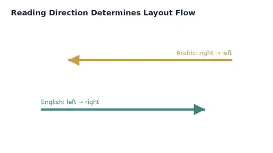
Arabic and English don’t just read in opposite directions — they also have different average character widths, different capitalization rules (Arabic has none), and different natural line lengths for the same sentence. Arabic is a right-to-left script, so a layout built for English first and then “filled in” with Arabic almost always breaks, because Arabic text frequently needs more horizontal space for the same information and reads in the opposite direction from the English block next to it. Treat the two languages as two separate design blocks that share a layout grid, not one block duplicated in two scripts.
Which language goes on top?
This depends on where the product is sold, not on company preference. If most buyers are local Saudi customers, Arabic goes first (top or right, since Arabic reads right-to-left) with English as the supporting line. If the product targets tourists, expats, or export markets, English typically goes first. For products sold both in-store and through online orders, match the language order to whichever channel drives more of your actual sales, and stay consistent across your whole product line — mixing the order from label to label looks accidental rather than intentional.
How do you keep both languages legible without shrinking either one?
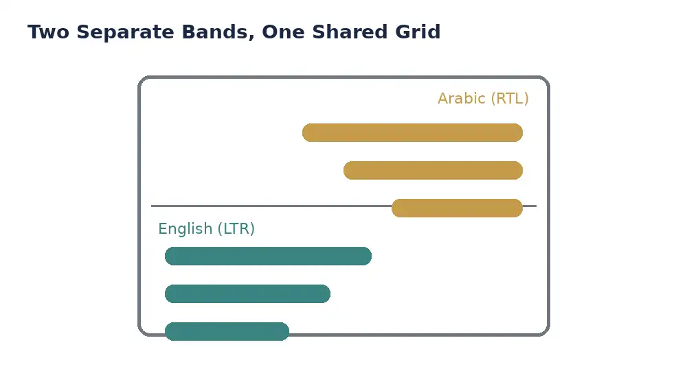
Give each language its own horizontal band on the label instead of stacking them character-by-character. A common working layout: product name and key claim in the primary language across the top half, the same information in the secondary language across the bottom half, with a clear visual divider (a thin rule or extra spacing) between them. This alone solves most of the “one language looks smaller” problem, because neither language has to compress into the other’s leftover space.
Does the printing method affect how well a bilingual label reads?
Yes, more than most sellers expect. Fine Arabic script (especially diacritics and connected letterforms) and small English type both need sharp, consistent print resolution to stay legible at real-world label sizes — a home printer’s ink bleed or a low-resolution export can blur Arabic letter joints first, since they’re visually denser than Latin characters at the same point size. Professional die-cut sticker printing with commercial-grade CMYK color calibration keeps both scripts sharp at the sizes most product labels actually use (2-5 cm). This is a separate concern from label durability — see our guide on why labels peel in heat and humidity if adhesive failure, not layout, is your issue.
Quick Reference: Layout Do’s and Don’ts
| Element | Do | Don’t |
|---|---|---|
| Language order | Match the primary buyer’s language | Alternate randomly by label |
| Text size | Equal visual weight for both languages | Shrink one language to fit space |
| Layout structure | Separate horizontal bands per language | Mirror one block into two scripts |
| Reading direction | Respect RTL for Arabic, LTR for English | Force English layout logic onto Arabic |
| Print resolution | Sharp print for dense Arabic letterforms | Low-resolution home printing for small text |
In short: give Arabic and English each their own space on the label, match language order to your primary buyer, and keep print resolution high enough that both scripts stay legible at real label sizes — not just on your screen.
Common Mistakes on Bilingual Labels
- Shrinking one language to “make it fit”: this almost always signals which language the business actually cares about, even unintentionally.
- Mirroring the English layout for Arabic: Arabic isn’t a translated copy of an English layout — it needs its own right-to-left structure.
- Using a decorative Arabic font at small sizes: ornate scripts that look elegant in a logo often become unreadable at label size; a clean, simple typeface reads better under 5 cm.
- Ignoring print resolution because the design looked fine on screen: what renders cleanly on a monitor can blur once printed at actual label size, especially for dense Arabic letterforms.
Checklist Before You Order Your Labels
- Decided which language leads based on your actual customer base, not personal preference
- Given both languages roughly equal visual weight, not one shrunk to fit
- Used a separate layout band for each language instead of mirroring one block
- Chosen a clean, simple typeface for the Arabic text at small sizes
- Tested the design at real print size (not just zoomed-in on screen) before ordering
- Ordered one approved sample from a professional vinyl sticker printer before committing to the full quantity
Frequently Asked Questions
Should Arabic or English come first on a Saudi product label? Match the order to your primary customer base — Arabic first for mostly local retail buyers, English first for export or tourist-facing products. Consistency across your product line matters more than the specific choice.
Why does my bilingual label look cramped even though I used a small font? The layout is likely treating both languages as one mirrored block instead of giving each its own horizontal band. Separating them with a clear divider almost always fixes the crowding.
Does bilingual text cost more to print? Not from the printing side — layout complexity affects design time, not print cost. The real cost driver is print quantity and material, the same as any single-language label.
Can I use the same layout for Arabic and English, just translated? No — Arabic’s right-to-left direction and different character widths mean a layout built for English rarely works when translated directly. Design each language’s block separately within a shared grid.
Bringing It Together
A bilingual label only works when Arabic and English are treated as two separate design blocks on a shared layout, not one block translated twice. Get the language order right for your actual customers, give both scripts equal visual weight, and print at a resolution sharp enough for dense Arabic letterforms to stay legible. When your layout is ready, request a quote or reach us directly on WhatsApp and start with one approved sample before the full print run.
Browse also: Sticker Printing